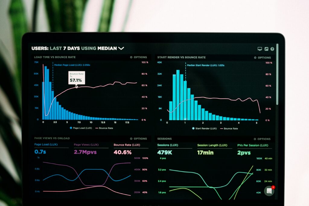
Data visualization is an important step in the data analysis process. It allows us to transform raw data into graphical representations, making patterns, trends, and insights easier to understand. Visualizations provide a compelling way to communicate your findings. For data visualization in Python, two libraries come to mind: Matplotlib and Seaborn.
These libraries enable the creation of everything from simple bar charts to more complex statistical plots. We’ll also touch upon the power of Business Intelligence (BI) tools like Tableau and PowerBI, which complement Python’s visualization capabilities.
The Jupyter notebook file associated with this blog post, which includes all of this information, can be found in our GitHub repo here. This post includes more detail in the .ipynb notebook file in the GitHub repo.
Why Visualization Matters
I have seen, perhaps more often than I would care to admit, data analysts and scientists sharing data tables while attempting to point out an insight. When it comes to communicating a data insight, it is almost always preferable to show rather than tell. Consider the below two ways of viewing the exact same set of data:
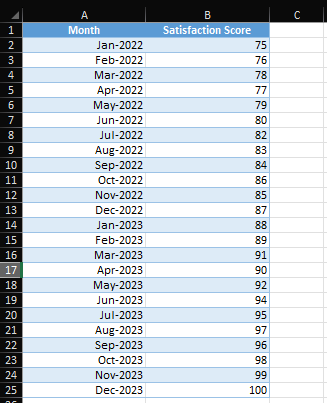
Scanning the data table from top to bottom I can see that there seems to be a steady increase overtime in Satisfaction scores between Jan-2022 and Dec-2023. Now let’s plot the data and compare.
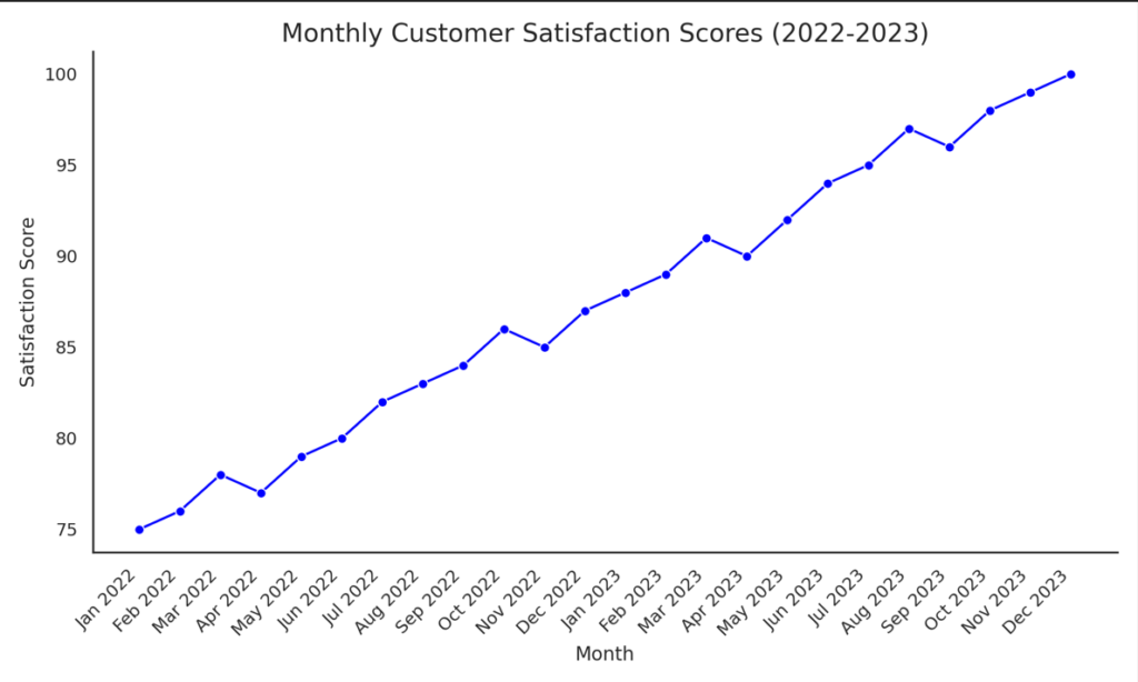
I don’t know about you but I’d have never spotted those dips in satisfaction that seem to be occurring on a cyclical basis without plotting the data. Maybe these dips coincide with service disruptions or changes in prices or policy? At any rate, the visualization has provided us a thread to pull on that I certainly wasn’t aware of by simply scanning the raw data – and that was a small data table!
So why is visualization important?
- Helps to identify patterns and trends.
- Simplifies complex data for better decision-making.
- Enhances storytelling with data, making reports more engaging.
Now let’s dig in to visualizing data with Python.
Getting Started: Overview of Matplotlib and Seaborn
Matplotlib is a flexible platform to create a wide variety of static, animated, and interactive plots. Seaborn is built on top of Matplotlib and offers a high-level interface for creating visually appealing and statistically insightful plots.
Before we can start creating visualizations with libraries, we’re going to need to install them into our environment. If you’re just joining us and need help setting up a virtual environment you can find information on how to do that in our Learning Python: Part 2 post.
pip install matplotlib seabornOnce you have the libraries installed, you can import them and begin creating visualizations. For simplicity, we’ll leverage the same survey dataset that we created during our Learning Python: Part 10 post. This next block of code will help you generate a similar set of data again if needed.
import numpy as np
import pandas as pd
import matplotlib.pyplot as plt
import seaborn as sns

# Set seed for reproducibility
np.random.seed(42)

# Generate survey dataset
num_responses = 100
survey_data = {
"Age": np.random.randint(18, 65, size=num_responses),
"Satisfaction_Level": np.random.choice(['Very Unsatisfied', 'Unsatisfied', 'Neutral', 'Satisfied', 'Very Satisfied'], size=num_responses), "Recommend_To_Friend": np.random.choice([True, False], size=num_responses), "Usage_Frequency": np.random.choice(['Daily', 'Weekly', 'Monthly', 'Rarely'], size=num_responses),
"Favorite_Feature": np.random.choice(['Feature A', 'Feature B', 'Feature C', 'Feature D'], size=num_responses)
}

# Create DataFrame
df = pd.DataFrame(survey_data)df['Recommend_To_Friend'] = df['Recommend_To_Friend'].astype(object)
Creating Simple Plots with Matplotlib
Matplotlib offers many basic plots like line graphs, bar charts, and histograms. Let’s start with a simple bar chart to visualize the distribution of survey respondents across satisfaction levels.
# Bar plot of satisfaction levels
plt.figure(figsize=(8, 5))
df['Satisfaction_Level'].value_counts().plot(kind='bar', color='skyblue')
plt.title('Survey Respondents by Satisfaction Level')
plt.xlabel('Satisfaction Level')
plt.ylabel('Number of Respondents')
plt.xticks(rotation=45)
plt.show()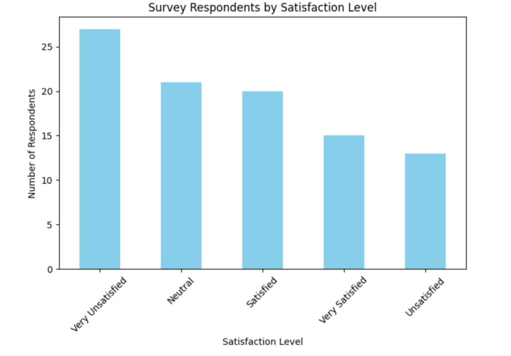
Depending on your randomly generated data set your counts may differ; however, the general idea is the same: we’ve generated a simple bar chart that shows us how many respondents fall into each satisfaction category, which can help identify whether most users are satisfied or unsatisfied.
Advanced Data Visualization with Seaborn
Seaborn simplifies creating complex plots and comes with beautiful default styles. It excels at visualizing statistical relationships in your data.
Creating Statistical Plots with Seaborn
Let’s start by creating a box plot to show the age distribution across different satisfaction levels.
# Create the Boxplot first
plt.figure(figsize=(10, 5))
sns.boxplot(y=df['Age'], color='orange')
plt.title('Age Boxplot')
plt.ylabel('Age')
plt.xlabel('')  # No x-axis label for the boxplot
plt.show()  # Display the boxplot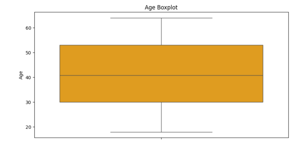
# Create the Histogram next
plt.figure(figsize=(10, 5))
sns.histplot(df['Age'], bins=10, kde=False, color='skyblue')
plt.title('Age Distribution (Histogram)')
plt.xlabel('Age')
plt.ylabel('Frequency')
plt.show()  # Display the histogram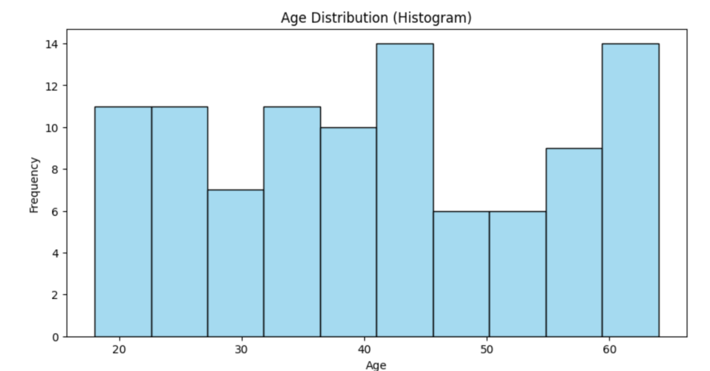
Customizing Plots Further
Seaborn makes it easy to customize plots. you can change the color palette, add titles, and adjust figure sizes.
Let’s create a heatmap to visualize the correlation between age and recommendation rate.
# Create a correlation matrix
df_corr = df[['Age', 'Recommend_To_Friend']].copy()
df_corr['Recommend_To_Friend'] = df_corr['Recommend_To_Friend'].map({True: 1, False: 0})

# Heatmap of correlations
plt.figure(figsize=(5, 4))
sns.heatmap(df_corr.corr(), annot=True, cmap='coolwarm', vmin=-1, vmax=1)
plt.title('Correlation Heatmap')
plt.show()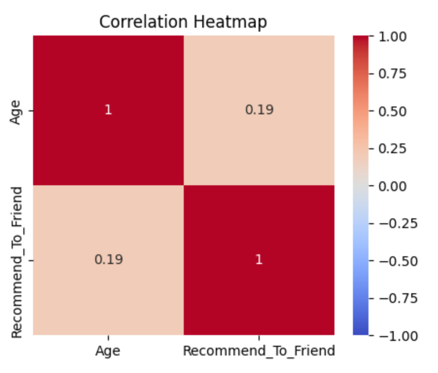
In this example, we mapped boolean values to integers to compute correlations and visualize the relationships between numerical features. This is particularly useful with large data sets that have a lot of numerical features since you can quickly scan for potential correlations between features using a correlation heatmap.
A Practical Example of a Visualization
Let’s take it a step further by combining Matplotlib and Seaborn to analyze usage frequency and its relationship to recommending the product to a friend.
# Count plot of Usage Frequency vs Recommendation
plt.figure(figsize=(10, 6))
sns.countplot(x='Usage_Frequency', hue='Recommend_To_Friend', data=df, palette='muted')
plt.title('Usage Frequency vs Recommend to a Friend')
plt.xlabel('Usage Frequency')
plt.ylabel('Count')
plt.show()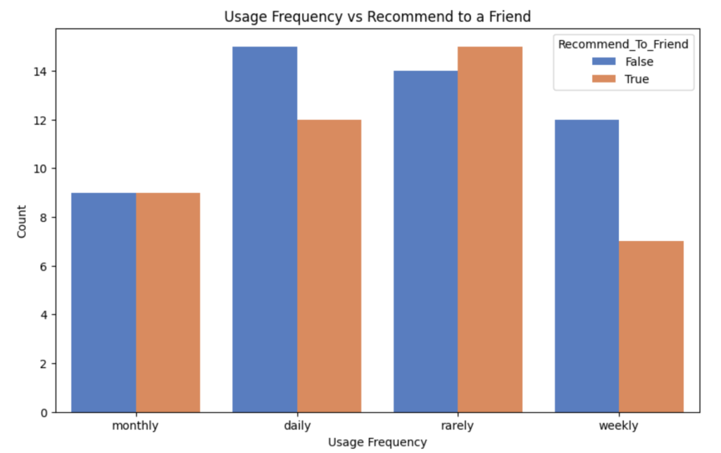
Now we have a count plot that illustrates how frequently users interact with the product and whether they’d recommend it to a friend.
Conclusion
Data visualization transforms raw numbers into stories. Matplotlib is great for basic plotting, while Seaborn helps with advanced, visually appealing statistical plots. Both tools are great for gaining a deeper understanding of your data and sharing insights with others.
